GUI Philosophy
Are there better ways to use computers than what we're served up by default?
What is an ideal wallpaper?
Good Wallpapers are mostly monochromatic. When windows are on top, they should become a non-intrusive background and not clash. But they can be any style otherwise - photo, abstract, drawing, etc.
- Windows XP: Ascent
- Ubuntu 6.06: Dapper Drake
Great monochromatic wallpapers that came as an OS default:


The original concept for the desktop
The original concept for what would evolve into the modern desktop first got popular on Mac OS.
The desktop was imagined to be at the "top" of a series of folders. When you used the Finder to explore the file system, each new folder spawned a separate window, as though you were "travelling down" into the computer. The position and and size of each Finder window was preserved after it was closed, so a user could remember a place in the filesystem based on it's location and appearance. The file system - not just the desktop - was structured like a physical environment the user could organize and develop muscle memory for. Memorizing spaces was easier than memorizing a list of names and file paths. The window was the folder. The Finder was the computer, not just a file manager program as it would later become.
And then Microsoft stole the idea and put it in Windows 95. Unlike DOS, where the file system itself was the "computer", disks were now tucked away under "My Computer" on your desktop. The desktop (explorer.exe) was now imagined to be the computer itself.
Visually the desktop looks exactly the same today, but at some point the spatial analogy was lost, (probably during the NeXT takeover, plus the idea that computers should organize things rather than leave them a mess), so now the desktop is just a vestigial shortcut dump in practice.
What is the ideal desktop organization?
Since we're stuck with the desktop (I don't expect you to write a shell replacement) How should we use it? I can imagine two equally valid philosophies - the clean desktop vs the workbench desktop.
In the workbench desktop, the desktop is a place for all of the files and folders that you're currently working on. Instead of program shortcuts, it's for anything you need to access at the moment. This would require some janitorial effort to keep the desktop from getting unusably messy. (On my old PCs, icons would invariably start to spill off the screen.) A third party program like Stardock Fences can be used to quickly organize things into separate spaces on the desktop.
In the clean desktop, the desktop is a blank canvas for windows, and nothing else. Files are accessed from and given organization within the file explorer and never on the desktop. Program shortcuts could be placed on the desktop and quickly accessed using the "show desktop" button on the Windows taskbar, however there are third party programs like SideSlide or Nexus Dock that can make opening programs much faster. (This is my current desktop.)
The Windows 7 taskbar was a mistake
The way the taskbar worked on Windows 95 through to Vista was that each open window had it's own tab on the taskbar. Between the tabs and the start button you could optionally add quick launch icons to open programs in a single click.
In Windows 7 every separate window is combined into a single icon, which is also the quick launch, permanently taking up space on the taskbar. (Were they copying Macs again?)
This is a problem.
It often takes two clicks to switch between running tasks, previously it only took one. The benefit of this is to have your screen filled with quick launch icons that aren't being clicked on 99% of the time. It's redundant. It's too easy to start a program on accident while attempting the common task of switching between the programs you were already using. Using the Window 10 task view as an alternative still takes an extra click or keyboard shortcut, and is disorienting when you're not sure where each window will pop up on the screen.

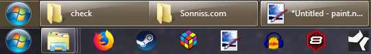
You could switch back as an option.

But now it's mandatory.
Everybody complains about the lack of tabs in the file explorer (Update: Microsoft added it), but the file explorer was actually already tab-like before this change. In uncombined mode it's easy to click on the wide buttons, so the taskbar can take up less vertical space on the screen.