Stimulating Web Design
Front Pages:
Black and White Lounge
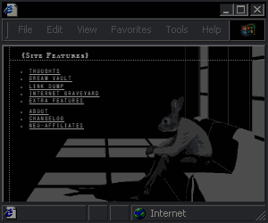
stolen from a 17 year old blog template (link) because it reminded me of those cool artist websites from 1999.

Desc.
Why should minimal mean boring? This layout was
*Nix
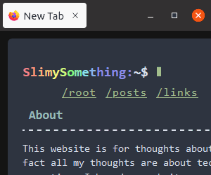

Desc.
I made this as a joke but those color themes are sweet.
Widescreen Minimalism
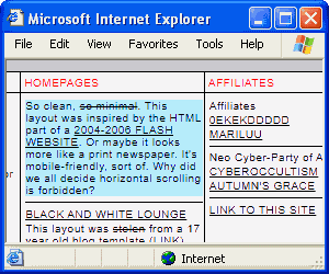
so minimal. This layout was inspired by the HTML part of a 2004-2006 Flash website. Or maybe it looks more like a print newspaper. It's mobile-friendly, sort of. Why did we all decide horizontal scrolling is forbidden?

Desc.
So clean,CSS Art:
 The Disco Inferno Page
Previously the Steve Dahl anti-shrine
 Psychedelic
Full Layouts:
Paperback
